Table of Contents
ToggleIntroduction
In this comprehensive guide, we will delve into the fundamental concepts of Linear Regression and Modeling. linear regression is a statistical method that helps us analyze the relationship between two or more variables. It allows us to predict one variable based on the others, making it a powerful tool in data analysis.
Linear Regression is like having your crystal ball – but instead of predicting the future, it helps us make informed decisions based on historical data patterns. By fitting a straight line to our data points, we can uncover trends and insights that might otherwise go unnoticed.
So why should you care about linear regression? Well, whether you’re analyzing sales figures, studying market trends, or even predicting stock prices, this technique can provide valuable insights that drive better decision-making.
This article covers the following topics:
-
- An example of a Machine Learning problem statement
-
- Downloading a dataset for Machine Learning
-
- Exploratory Analysis and Visualization
-
- Correlation
-
- linear regression with single variable
-
- Linear Regression using Scikit-learn
Problem Statement of Linear Regression and Modeling
In this tutorial, we will define Linear Regression and Modeling in the context of a problem, and then generalize their definitions. We will work through a typical Machine-Learning problem of Predicting Medical Expenses using Linear Regression and Modeling step by step:
Here is a CSV file that contains verified historical data, including the aforementioned information as well as actual medical records.
Data download
Let’s begin by downloading the data using urllib.request’s urlretrieve function.
You will need Python, the notebook, and the necessary libraries to run the code locally, The Conda Python distribution is recommended but Using Google Colab or Kaggle is the easiest way to start executing the code.
!pip install pandas-profiling --quietmedical_charges_url = https://github.com/stedy/Machine-Learning-with-R-datasets/blob/master/insurance.csvfrom urllib.request import urlretrieveurlretrieve(medical_charges_url, 'insurance.csv')(‘medical.csv’, <http.client.HTTPMessage at 0x2183b073710>)
To view and analyze the data, we can create a Pandas dataframe using the downloaded file.
import pandas as pdmedical_df = pd.read_csv('medical.csv')medical_df
| AGE | SEX | BMI | CHILDEREN | SMOKER | REGION | CHARGES | |
|---|---|---|---|---|---|---|---|
| 0 | 19 | female | 27.900 | 0 | yes | southwest | 16884.92400 |
| 1 | 18 | male | 33.770 | 1 | no | southeast | 1725.55230 |
| 2 | 28 | male | 33.000 | 3 | no | southeast | 4449.46200 |
| 3 | 33 | male | 22.705 | 0 | no | northwest | 21984.47061 |
| 4 | 32 | male | 28.880 | 0 | no | northwest | 3866.85520 |
| … | … | … | … | … | … | … | … |
| 1333 | 50 | male | 30.970 | 3 | no | northwest | 10600.54830 |
| 1334 | 18 | female | 31.920 | 0 | no | northeast | 2205.98080 |
| 1335 | 18 | female | 36.850 | 0 | no | southeast | 1629.83350 |
| 1336 | 21 | female | 25.800 | 0 | no | southwest | 2007.94500 |
| 1337 | 61 | female | 29.070 | 0 | yes | northwest | 29141.36030 |
1338 rows × 7 columns
There are 1338 rows and 7 columns in the dataset. Each row contains information about one customer.
Our objective is to estimate the value of the “charges” column using the values of the other columns. Using historical data, we should be able to estimate charges for new customers, too, by simply asking for their age, gender, body mass index, number of children, smoking habits, and region.
Let’s look at each column to see what type it is.
medical_df.info()<class ‘pandas.core.frame.DataFrame’>
RangeIndex: 1338 entries, 0 to 1337
Data columns (total 7 columns):
| # | Column | Non-Null Count | Dtype | |
| 0 | Age | 1338 non-null | int64 | |
| 1 | Sex | 1338 non-null | object | |
| 2 | Bmi | 1338 non-null | float64 | |
| 3 | children | 1338 non-null | int64 | |
| 4 | smoker | 1338 non-null | object | |
| 5 | region | 1338 non-null | object | |
| 6 | charges | 1338 non-null | float64 |
It appears that “age”, “children”, “BMI” (body mass index), and “charges” are numbers, whereas “sex”, “smoker” and “region” are strings (possibly categories). The numerical columns do not contain any missing values, so we save a lot of time!
Here are some statistics for them:
medical_df.describe()| age | bmi | childrern | charges | |
| count | 1338.000000 | 1338.000000 | 1338.000000 | 1338.000000 |
| mean | 39.207025 | 30.663397 | 1.0949181 | 13270.422265 |
| std | 14.049960 | 6.098187 | 1.205493 | 12110.011237 |
| min | 18.000000 | 15.960000 | 0.000000 | 1121.873900 |
| 25% | 27.000000 | 26.296250 | 0.000000 | 4740.287150 |
| 50% | 39.000000 | 30.400000 | 1.000000 | 9382.033000 |
| 75% | 51.000000 | 34.693750 | 2.000000 | 16639.912515 |
| max | 64.000000 | 53.130000 | 5.000000 | 63770.428010 |
We may not need to do much data cleaning or correction in the numerical columns (there are no negative ages), but the “charges” column is significantly skewed, as the median (50 percentile) is much lower than the maximum.
Exploratory Analysis and Visualization
Visualize the distribution of values in some columns of the dataset, and the relationships between “charges” and other columns.
Follow these tutorials to learn how to use Matplotlib, Seaborn, and Plotly for visualization:
!pip install plotly matplotlib seaborn --quietimport plotly.express as pximport matplotlibimport matplotlib.pyplot as pltimport seaborn as sns%matplotlib inline
Our charts will look better with the following settings.
sns.set_style('darkgrid')matplotlib.rcParams['font.size'] = 14matplotlib.rcParams['figure.figsize'] = (10, 6)matplotlib.rcParams['figure.facecolor'] = '#00000000'Age
The age column in the dataset is numeric. The minimum age is 18 and the maximum age is 64. We can visualize the distribution of age using a histogram with 47 bins (one for each year) and a box plot. The chart will be interactive using plotly, but similar charts can also be created using Seaborn.
medical_df.age.describe()count 1338.000000
mean 39.207025
std 14.049960
min 18.000000
25% 27.000000
50% 39.000000
75% 51.000000
max 64.000000
Name: age, dtype: float64fig = px.histogram(medical_df,
x='age',
marginal='box',
nbins=47,
title='Distribution of Age')
fig.update_layout(bargap=0.1)
fig.show()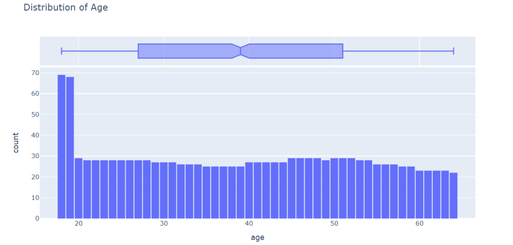
Except for the ages 18 and 19, who seem to have over twice as many customers as the other ages, the distribution of ages in the dataset is almost uniform, with 20-30 customers at every age. The uniform distribution may be because there isn’t much variation in the number of people of any given age (between 18 & 64) in the USA.
Using a histogram and box plot, let’s analyze the BMI (Body Mass Index) distribution of customers
fig = px.histogram(medical_df,
                   x='bmi',
                   marginal='box',
                   color_discrete_sequence=['light blue'],
                   title='Distribution of BMI (Body Mass Index)')
fig.update_layout(bargap=0.1)
fig.show()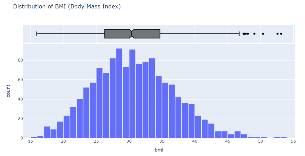
According to the BMI measurements, the distribution appears to be Gaussian, centered around 30, with a few outliers to the right.
Charges
Using the categorical column “smoker,” let’s differentiate the charges for smokers from the charges for nonsmokers. Let’s visualize the distribution of “charges,” i.e. the annual medical charges for customers.
fig = px.histogram(medical_df,
                   x='charges',
                   marginal='box',
                   color='smoker',
                   color_discrete_sequence=['red', 'grey'],
                   title='Annual Medical Charges')
fig.update_layout(bargap=0.1)
fig.show()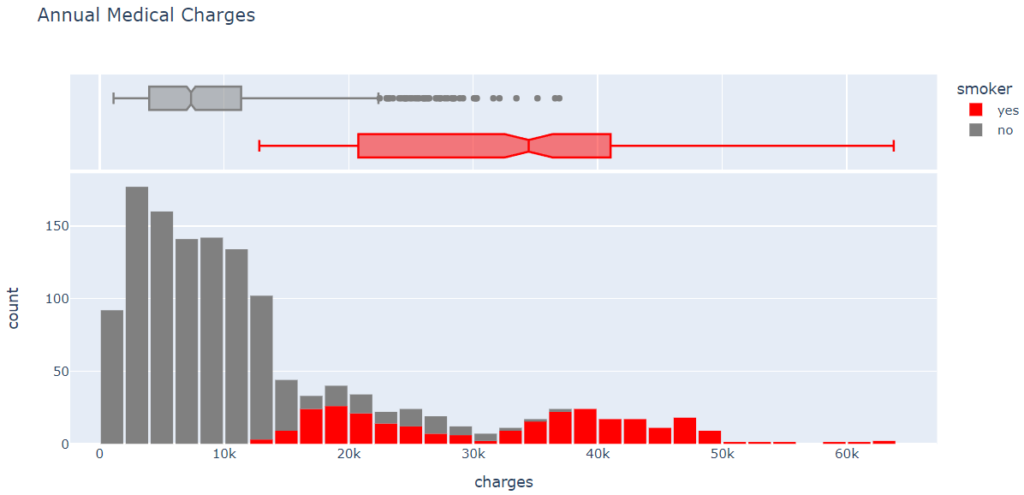
From the above graph, we can observe that the average medical cost for most customers is under $10,000 per year. Only a small fraction of customers have higher medical costs, perhaps as a result of accidents, major illnesses, or genetic disorders. There is a significant difference in medical expenses between smokers and nonsmokers. While the median for nonsmokers is 7300, the median for smokers is close to 35000.
Smoker
Using a histogram, we can visualize the distribution of the “smoker” column (containing “yes” and “no” values).
medical_df.smoker.value_counts()no 1064
yes 274
Name: smoker, dtype: int64px.histogram(medical_df, x='smoker', color='sex', title='Smoker')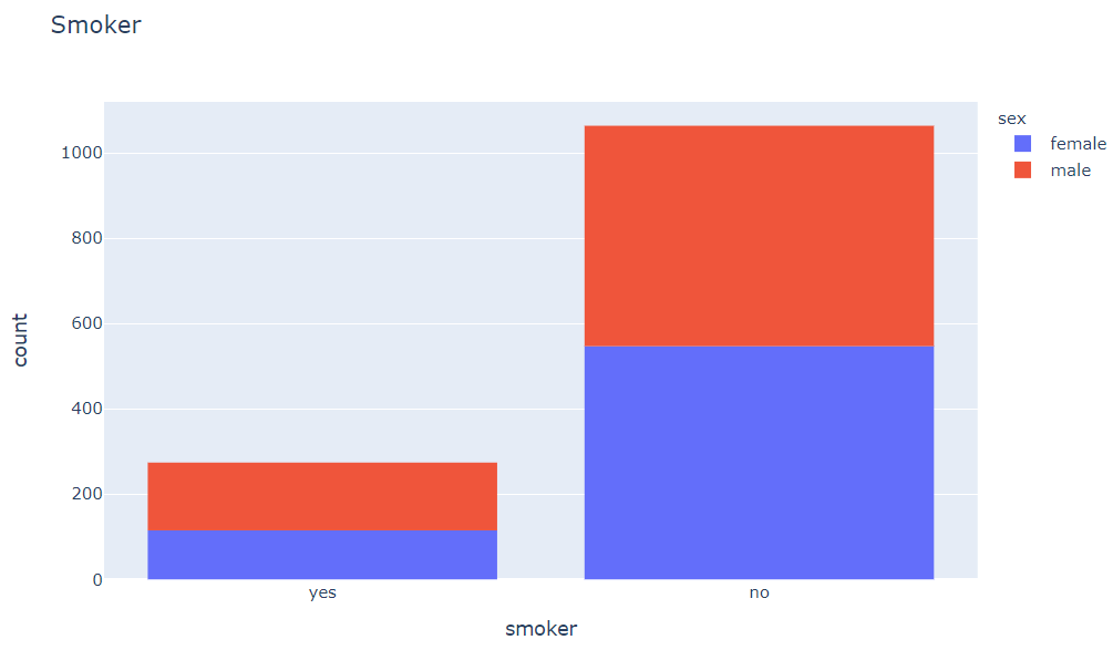
We see that 20% of customers smoke. Can you confirm whether this matches the national average, assuming the data was collected in 2010? We also see that smoke appears to be more common among males.
As a result of looking at individual columns, we can now visualize the relationship between “charges” (the value we wish to predict) and other columns.
Age and Charges
We will use a scatter plot to visualize the relationship between “age” and “charges.” Each point represents one customer, and we will color the points according to the “smoker” column.
fig = px.scatter(medical_df,
                 x='age',
                 y='charges',
                 color='smoker',
                 opacity=0.8,
                 hover_data=['sex'],
                 title='Age vs. Charges')
fig.update_traces(marker_size=5)
fig.show()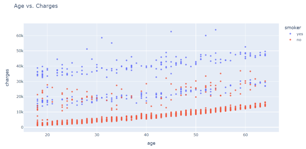
Based on the above chart, we can observe the following:
-
- In general, medical charges increase with age, as we might expect. However, there are significant variations at every age, and age alone cannot determine medical charges accurately.
-
- Three clusters of points appear to form a line with an increasing slope:
-
- First, the largest cluster consists primarily of “healthy non-smokers” with relatively low medical costs.
2. The second cluster consists of both smokers and non-smokers. There may be two distinct but overlapping clusters: “non-smokers with medical issues” and “smokers without major medical issues”.
3. Lastly, the final cluster consists exclusively of smokers, presumably smokers with major medical issues linked to or exacerbated by smoking.
BMI and Charges
In another scatter plot, we will use the values from the “smoker” column to color the points based on BMI (body mass index).
fig = px.scatter(medical_df,
                 x='bmi',
                 y='charges',
                 color='smoker',
                 opacity=0.8,
                 hover_data=['sex'],
                 title='BMI vs. Charges')
fig.update_traces(marker_size=5)
fig.show()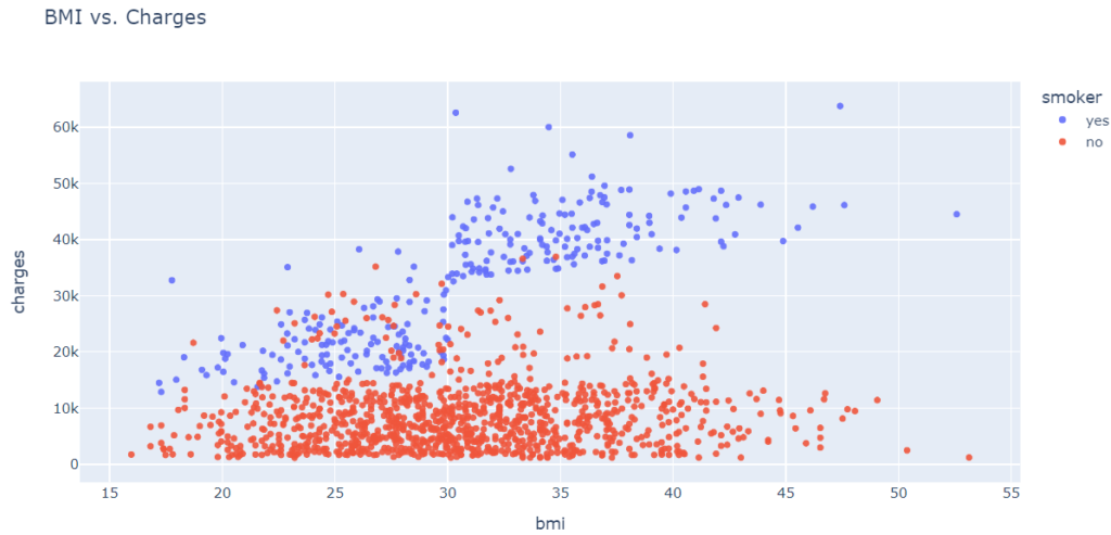
Medical charges appear to be significantly higher for smokers with a BMI greater than 30 than for non-smokers with an elevated BMI.
Correlation
As you can tell from the analysis, the values in some columns are more closely related to the values in “charges” compared to other columns. For instance, “age” and “charges” tend to grow together, while “bMI” does not. In Pandas series, the .corr method can be used to calculate this relationship numerically.
medical_df.charges.corr(medical_df.age)0.19834096883362895
Categorical columns must first be converted into numeric columns before the correlation can be calculated.
smoker_values = {'no': 0, 'yes': 1}smoker_numeric = medical_df.smoker.map(smoker_values)medical_df.charges.corr(smoker_numeric)
0.787251430498478
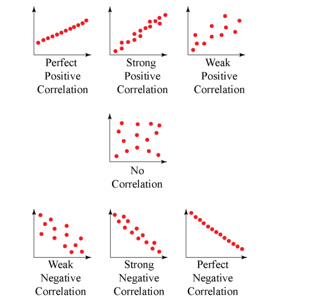
Strength:
The stronger the correlation coefficient, the greater its absolute value.
-
- A perfectly linear relationship occurs when a change in one variable is accompanied by a perfectly consistent change in the other. For these relationships, all the data points fall on the same line. You will not see either type of perfect relationship in practice.
-
- Whenever one variable increases, there is no tendency for the other variable to increase or decrease.
-
- As r approaches -1 or 1, the strength of the relationship increases, and the data points tend to fall closer to a line.
Direction:
The sign of the correlation coefficient indicates the direction of the relationship.
-
- An upward slope can be seen on a scatterplot when the value of one variable increases and the value of the other variable increases. Positive coefficients indicate that when one variable increases, the other variable also tends to increase.
-
- In negative relationships, the value of one variable tends to increase while the value of the other variable tends to decrease.
Here’s the same relationship expressed visually.
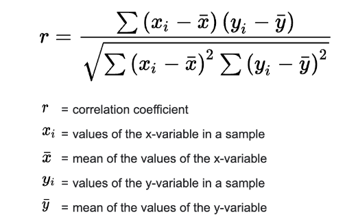
Correlation coefficients are calculated as follows:
Here is more information about the mathematical definition and geometric interpretation of correlation:
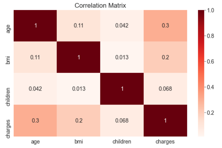
A .corr method is also provided by Pandas dataframes to calculate correlation coefficients between numeric columns.
medical_df.corr()| age | bmi | children | charges | |
|---|---|---|---|---|
| age | 1.000000 | 0.109272 | 0.042469 | 0.299008 |
| bmi | 0.109272 | 1.000000 | 0.012759 | 0.198341 |
| children | 0.042469 | 0.012759 | 1.000000 | 0.067998 |
| charges | 0.299008 | 0.198341 | 0.067998 | 1.000000 |
sns.heatmap(medical_df.corr(), cmap='Reds', annot=True)plt.title('Correlation Matrix');
Correlation vs causation fallacy:
It should be noted that a high correlation does not necessarily indicate a cause-and-effect relationship between features. Correlation can exist between two features, X and Y, if X causes Y, Y causes X, or if both are caused independently by some other factor Z. However, if one of these cause-and-effect relationships is broken, the correlation may no longer hold. Additionally, correlations may also be misleading due to small sample sizes.
While this may seem like common sense, it’s crucial to remember that computers are not able to distinguish between correlation and causation. This is especially important because automated systems have the power to greatly impact society and their decisions should be thoroughly studied to understand their underlying factors. Ultimately, identifying cause-and-effect relationships requires human insight.
Linear Regression using a Single Feature
Let’s try to estimate the value of “charges” using the “age” column for non-smokers. First, create a data frame containing only non-smokers’ data.
non_smoker_df = medical_df[medical_df.smoker == 'no']The next step is to visualize the relationship between “age” and “charges.”
plt.title('Age vs. Charges')sns.scatterplot(data=non_smoker_df, x='age', y='charges', alpha=0.7, s=15);
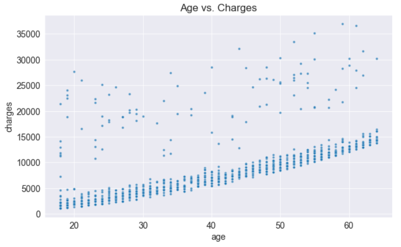
Using these points, we will try to “fit” a line, and then use that line to predict charges for a given age. The equation for a line on X&Y coordinates is
y = wx+b
The line is characterized by two numbers: w (referred to as “slope”) and b (referred to as “intercept”).
Model
Using the above example, we assume the following relationship between the x-axis and the y-axis:
charges=w×age+b
For the line that best fits the data, we’ll try to determine w and b.
-
- The above equation is a linear regression model since it models the relationship between “age” and “charges” as a straight line.
-
- w and b are known as the parameters or weights of the model.
-
- The values in the “age” column of the dataset are called inputs to the model, while the values in the charges column are called targets.
To compute the charges given age, w, and b. let’s define a helper function estimate_charges.
def estimate_charges(age, w, b): return w * age + bThe estimate_charges function is our very first model.
Let’s guess the values for w and b.
w = 60b = 200
ages = non_smoker_df.age
estimated_charges = estimate_charges(ages, w, b)
We can plot the estimated charges using a line graph.
plt.plot(ages, estimated_charges, 'r-o');
plt.xlabel('Age');
plt.ylabel('Estimated Charges');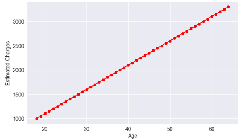
The points lie in a straight line as expected.
Our model can be overlayed on actual data to see how well it fits.
target = non_smoker_df.charges
plt.plot(ages, estimated_charges, 'r', alpha=0.9);
plt.scatter(ages, target, s=8,alpha=0.8);
plt.xlabel('Age');
plt.ylabel('Charges')
plt.legend(['Estimate', 'Actual']);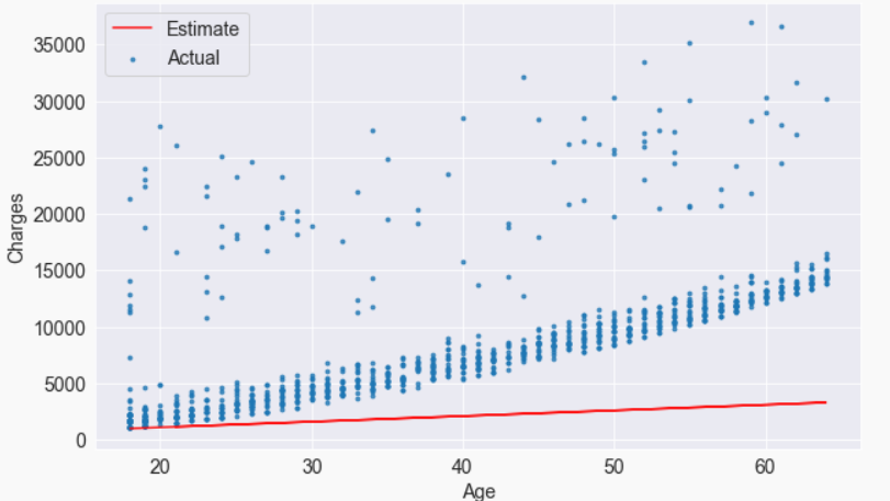
It is apparent that the estimates we have are quite poor and the line does not “fit” the data. However, we can try different values of w and b to move the line around. Let us define a helper function try_parameters, which takes w and b as inputs and creates the plot above.
def try_parameters(w, b):
ages = non_smoker_df.age
target = non_smoker_df.charges
estimated_charges = estimate_charges(ages, w, b)
plt.plot(ages, estimated_charges, 'r', alpha=0.9);
plt.scatter(ages, target, s=8,alpha=0.8);
plt.xlabel('Age');
plt.ylabel('Charges')
plt.legend(['Estimate', 'Actual']);try_parameters(70, 200)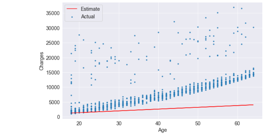
try_parameters(400, 5000)
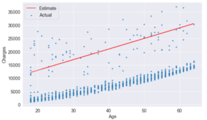
When we change the values w, and b, In addition to manually moving the line closer to the points, we are learning the approximate relationship between “age” and “charges”.
Couldn’t it be nice if a computer could learn the relationship between “age” and “charges” by trying different values of b and w? Here are a couple of problems to solve:
-
- It is necessary to measure how well the line fits the points numerically.
-
- We need a way to modify w and b once the “measure of fit” has been computed.
Starting from a random guess, a computer should be able to determine w and b for the best-fit line.
Loss/Cost Function
To assess the accuracy of our model’s predictions, we can utilize the following approach:
-
- Find the difference between the predicted values and actual targets (this is known as the “residual”).
-
- Square all values in the residual matrix to eliminate any negative values.
-
- Compute the average of all values in the resulting matrix.
-
- Take the square root of this result, which will give us a single number known as the root mean squared error (RMSE).
This method can be expressed mathematically as:
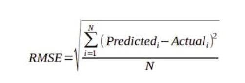
Geometrically, the residuals can be visualized as follows:
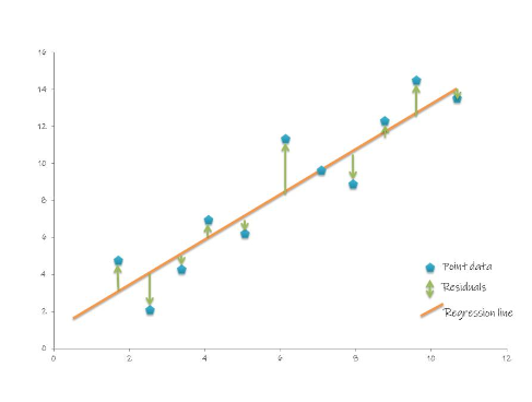
To compute the RMSE, let’s define a function.
!pip install numpy --quietimport numpy as npdef rmse(targets, predictions):
return np.sqrt(np.mean(np.square(targets - predictions)))A sample set of weights will be used to compute the RMSE
w = 60
b = 200try_parameters(w, b)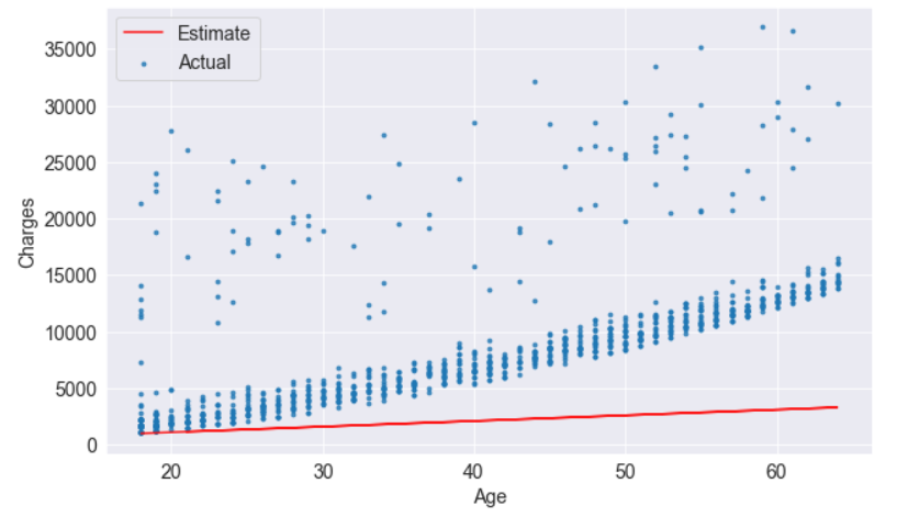
targets = non_smoker_df['charges']
predicted = estimate_charges(non_smoker_df.age, w, b)
rmse(targets, predicted)rmse(targets, predicted)
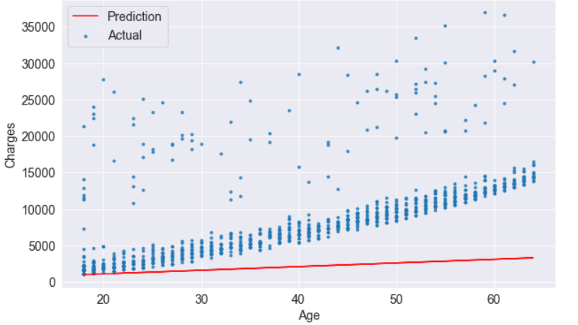
As a result of the above number, each element in the prediction differs by /$8461 on average from the actual target.
In the model, the loss represents information loss: the lower the loss, the better the model. It represents how bad the model is at predicting the target variables.
The try_parameters function should now display the loss, too.
def try_parameters(w, b):
    ages = non_smoker_df.age
    target = non_smoker_df.charges
    predictions = estimate_charges(ages, w, b)

    plt.plot(ages, predictions, 'r', alpha=0.9);
    plt.scatter(ages, target, s=8,alpha=0.8);
    plt.xlabel('Age');
    plt.ylabel('Charges')
    plt.legend(['Prediction', 'Actual']);

    loss = rmse(target, predictions)
    print("RMSE Loss: ", loss)
try_parameters(60, 200)
RMSE Loss: 8461.949562575493
Optimizer
To reduce the loss and improve the fit of the line to the data, we need to modify weights w and b.
-
- Ordinary Least Squares: (better for smaller datasets)
-
- Stochastic gradient descent: (better for larger datasets)
However, while ordinary least squares directly calculate the best values for w and b using matrix operations, gradient descent uses an iterative approach, starting with a random w and b value and gradually improving them with derivatives.
Both of these have the same objective: to minimize the loss, however.
Linear Regression
Isn’t it similar to the way we gradually move the line closer to the points?
Linear Regression using Scikit-learn
Generally, you don’t need to implement either of these methods yourself. A library like Scikit-learn will do this for you.
!pip install scikit-learn --quietLet’s use the LinearRegression class from scikit-learn to find the best-fit line for “age” vs. “charges” using the ordinary least squares optimization technique.
from sklearn.linear_model import LinearRegression
The first step is to create a new model object.
model = LinearRegression()To find the best-fit line for the inputs and targets, we can use the fit method of the model.
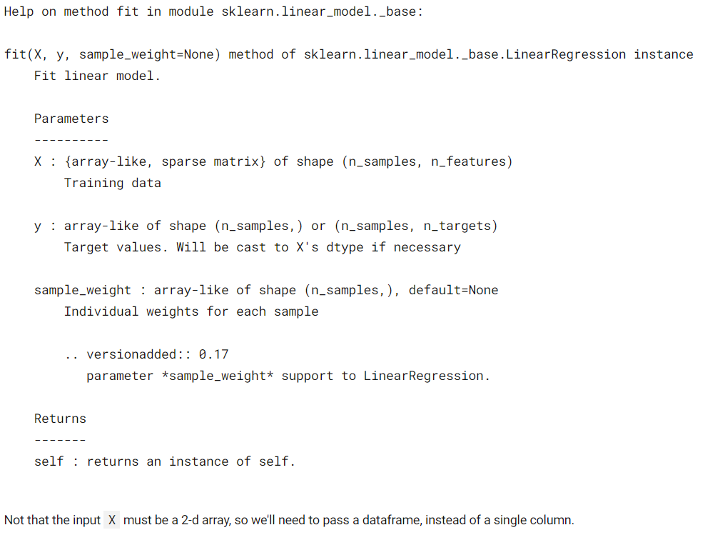
inputs = non_smoker_df[['age']]
targets = non_smoker_df.charges
print('inputs.shape :', inputs.shape)
print('targes.shape :', targets.shape)
inputs.shape : (1064, 1)
targes.shape : (1064,)Now let’s fit the model to the data.
model.fit(inputs, targets)
LinearRegression()
The model can now be used to predict charges for ages 23, 37, and 61.
model.predict(np.array([[23],
                        [37],
                        [61]]))
array([ 4055.30443855, 7796.78921819, 14210.76312614])
Do these values seem reasonable?
Compare them with the scatter plot above. Calculate predictions for the full set of inputs.
predictions = model.predict(inputs)predictionsarray([2719.0598744 , 5391.54900271, 6727.79356686, …, 2719.0598744 ,
2719.0598744, 3520.80661289])
To evaluate the model, let’s compute the RMSE loss.
rmse(targets, predictions)
4662.505766636395
Seems like our prediction is off by $4000 on average, which is not too bad because there are several outliers.
The coef_ and intercept_ properties store the model’s parameters.
# w model.coef_array([267.24891283])
# b model.intercept_-2091.4205565650864
Are these parameters close to your best guesses?
Now let’s see what the line looks like.
try_parameters(model.coef_, model.intercept_)RMSE Loss: 4662.505766636395
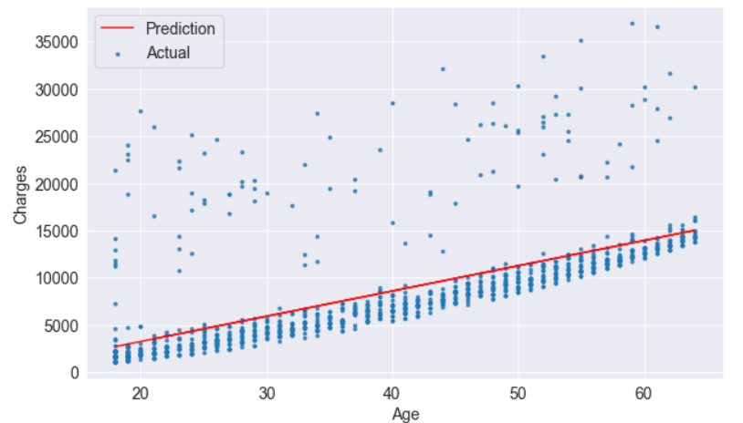
In fact, the line is quite close to the points. It is slightly above the cluster of points because it also accounts for outliers.
You have just trained your first Machine-Learning model! Machine learning is simply the process of computing the best parameters to model the relationship between certain features and targets.
So, you’ve built your Linear Regression Model or Modeling. now you’re looking for ways to take it up a notch. One key tip is to tackle multicollinearity – when predictors are highly correlated, it can mess with the accuracy of your model or Modeling. Consider dropping one of the variables or using techniques like Principal Component Analysis.
Another strategy is adding polynomial terms to capture non-linear relationships in your data. Sometimes a straight line just won’t cut it! By introducing squared or cubed terms, you can better fit complex patterns in your dataset.
Don’t forget about regularization techniques like Ridge and Lasso regression. These methods help prevent overfitting by adding penalties to the coefficients, leading to more robust models.
Keep experimenting and refining your approach – finding the right balance between simplicity and complexity will ultimately lead to more accurate predictions. Happy modeling!


